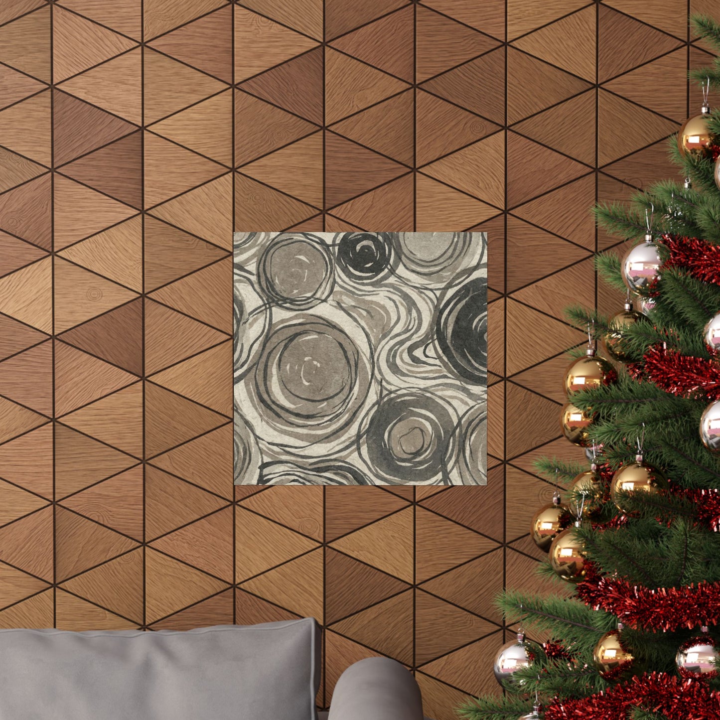
As the seasons turn, this Wabi-sabi Pattern Japandi Japanese Pattern Wall Art Print brings a grounded sense of change to the wall. Its taupe and warm grey palette feels especially suited to transitional months, when interiors often call for texture, restraint, and softer visual rhythm. The design features organic natural forms arranged in a Japanese-pattern inspired composition, with full bleed artwork that fills the entire print edge to edge, without white margins or a border.
This is AI-generated digital artwork created for print-on-demand production. The result is a poster with a balanced Japandi character: minimal, earthy, and visually layered without feeling ornate. Subtle irregular shapes and muted tonal shifts give the pattern an aged, weathered sensibility associated with wabi-sabi aesthetics, while the overall layout stays clean enough for modern interiors.
Design Approach
The artwork focuses on natural asymmetry rather than strict geometry. Soft taupe fields, warm grey accents, and understated pattern movement create a composition that feels organic and composed. Instead of relying on high contrast or decorative excess, the print uses muted color relationships and edge-to-edge coverage to make the pattern feel immersive across the full poster surface.
Its Japanese-pattern influence is interpreted through a contemporary Japandi lens. The forms suggest nature, patina, and seasonal material change, but the piece remains clearly digital artwork rather than a reproduction of a traditional process. This makes it well suited for interiors that pair wood, linen, ceramic, stone, or neutral upholstery.
Poster Details
-
Small: 11×14" for compact walls, shelves, or a layered frame setup.
-
Medium: 18×24" for above a desk or beside a reading nook.
-
Large: 24×36" for a gallery wall arrangement or a wider focal area.
-
Finish: printed on heavyweight poster paper with a smooth matte surface that reduces glare and supports the muted palette.
Styling Notes
This poster works best where its restrained pattern can be seen up close: above a desk, near a reading nook, or grouped with abstract landscapes and neutral architectural prints. Pair it with black, walnut, oak, or natural wood frames depending on the surrounding furniture. The warm grey and taupe colors also sit comfortably with off-white walls, plaster tones, charcoal accents, and soft beige textiles.
Because the artwork is full bleed, the image reaches every edge of the printed area for a more finished, gallery-style presentation when framed. The seasonal feel comes through in its subdued colors and organic pattern language, making it an adaptable piece for interiors that change with textiles, lighting, and natural materials throughout the year.